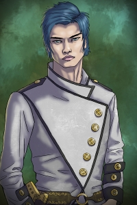
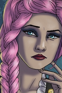
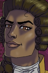
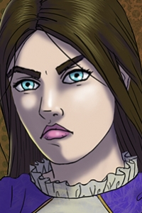
post

How to set up a panning system (like Danganronpa) in Ren’py

For my next release, Serafina’s Crown, I want to use the programming knowledge I’ve accumulated from my first two games to add a lot of fun and new features to the experience. One really big thing I wanted to add was a scene in a large room that pans from one character to another, sort of like the game Danganronpa. But if you’ve ever used Ren’py, you know that setting this up isn’t easy.

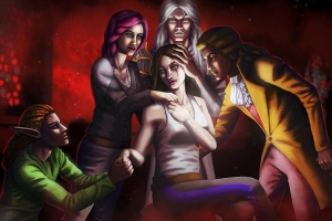
Picture something like what’s in my picture above, but zoomed in so only one character shows on the screen at a time. Sounds simple, right? But this is actually difficult to achieve in Ren’py if you want to keep your characters dynamic (changing expressions or moving if needed).

I went to the Ren’py forums for help, and they suggested I try using the layer systems. It required a lot of tweaking, but I finally got it to work. So I thought I would share my system here in case anyone else finds it useful.

For reference, my background is a 5000 pixel-wide layer. My characters are sized 800 x 1200 pixels. The screen size of my game is 1280 x 720.

First, I defined my own layer called pan in the options script:

Code:

init -1 python hide:

config.layers = [ ‘master’, ‘pan’, ‘transient’, ‘screens’, ‘overlay’ ]

Then I defined camera angles and character placements using transforms in my own init code. This part required a whole lot of trial and error. The “a_characters” position the overall layer, or camera angle; the “p_characters” place the character on a certain point. For some reason, the xpos needed to be very different for each, even though you’d think they’d be the same. But these are the coordinates that worked for me:

Code:

init python:

def cameraMove(x):

global currentX
currentX = x
return currentX

transform a_center:

xpos currentX
linear 0.4 xpos -1700 yalign 0.0
cameraMove(0)

transform a_Arken:

xpos currentX
linear 0.4 xpos 0 yalign 0.0
cameraMove(0)

transform p_Arken:

xpos 50 yalign 0.0

transform a_Serafina:

xpos currentX
linear 0.4 xpos -1250 yalign 0.0
cameraMove(-1250)

transform p_Serafina:

xpos 1400 yalign 0.0

transform a_Reuben:

xpos currentX
linear 0.4 xpos -2000 yalign 0.0
cameraMove(-2000)

transform p_Reuben:

xpos 2200 yalign 0.0

transform a_Kendal:

xpos currentX
linear 0.4 xpos 1700 yalign 0.0
cameraMove(1700)

transform p_Kendal:

xpos -1450 yalign 0.0

I created the function cameraMove(x) so that I would have a global variable keeping track of the camera’s location. Otherwise, when the camera panned from one direction to another, it would always start at the center and *then* pan to a character (very headache-inducing). This way it’s a lot smoother each time.

And finally, here’s the code I use for the scene itself:

Code:

label Duma:

$ currentX = -1700

with None
show Arken onlayer pan zorder 1 at p_Arken
show Serafina at p_Serafina onlayer pan
show Reuben at p_Reuben onlayer pan
show Kendal at p_Kendal onlayer pan
show Duma onlayer pan zorder 0 at a_center behind Arken, Serafina, Reuben, Kendal
with dissolvea “Praise be upon the gods; praise be upon Darzia. I call to form a special session of the Royal Duma of Queen Belatrix Grandil… who can no longer preside, may she rest in peace.”
a “Members of the Petit Duma, please announce your presence.”show layer pan at a_Serafina
s “Serafina, of House Elborn.”

show layer pan at a_Reuben
r “Reuben, of House Jeridar.”

show layer pan at a_Kendal
k2 “Kendal, of House Terrace.”

show layer pan at a_Arken
show Arken 2 onlayer pan at p_Arken
a “May it be heard …”

And there you have it. The camera pans around the room from one character to the next.

I noticed that while using the layer system, you need to mention the layer and sprite placement every time (hence I couldn’t just say “show Arken 2” when he changed expressions; I needed to say “show Arken 2 onlayer pan at p_Arken.” But if it works, it works. So I’m just excited I’ll be able to pull this off!

post

Serafina’s Crown – Released!

Serafina’s Crown, the sequel to Serafina’s Saga, is now released!

Download Chapter 1 free as a Demo

Google Play

Released on Steam!

The sequel takes place seven years after the end of the Serafina’s Saga visual novel. Grand Prince Robil Feldren dies of illness, and a few weeks later, Queen Belatrix Grandil dies in in the midst of a “hunting accident.”  Serafina Elborn and her husband Reuben Jeridar are posed to take the throne, except for one big problem: many nobles suspect Reuben Jeridar arranged the assassination of Belatrix Grandil.

You play as a new character, Odell Perin, who is unwittingly thrust into a position of power amidst the chaos of court. Due to her neutral stance, Odell Perin is elected to serve as Regent long enough to settle the ongoing disputes, and therefore determine who will become the next King or Queen of Darzia. The gameplay will feature a dynamic debate system that allows Odell to argue certain points in court based on her accumulated stats.

General walkthrough

Key Features:

  • Branching Narrative: Every decision made as Odell will change the story — whether it’s getting closer to finding the murderer, stabilizing the kingdom, or helping the next monarch rise to power.
  • Stats Management: Odell’s decisions will affect her stats, which will help her debate her beliefs in court.
  • Debate Mini-Game: The game features an entertaining mini-game where Odell (with the help from the stats she’s earned on her journey) will debate a variety of topics to uncover new, important information.
  • Girl x Boy / Girl x Girl Romances: Just because Odell is ruling a kingdom doesn’t mean she won’t save some time for romance
  • Voice Acting: Serafina’s Crown features a cast of talented voice actors that bring the story to life.

You’ll see many familiar faces in Serafina’s Crown, including Reuben, Kallias, Arken, Nikolaos, and–of course–Serafina. You’ll also meet many new characters, as well as Picard, a major character from the Ashes of Dearen novels.

newCharacters

***

CREDITS:

Voices:
Odell: Carol Mertz
Arken: David Dixon
Kendal: Matthew Curtis
Roza: Amber Leigh
Serafina: Rachael Messer
Reuben: Jacob Anderson
Kallias: Andrew Graffham
Lorenzo: Miguel Moran
Picard: David Dixon
Nikolaos: Drew Becker
 
Writing: Jenny Gibbons and Malcolm Pierce
Art: Jenny Gibbons
Sound Design: Drew Becker
Music: Jenny Gibbons
post

Animating Speech

*This post is from my Tumblr a  while back, but I thought it might be useful to re-post it here!*

After creating my Serafina’s Saga animation (20 friggin minutes of animated frames), I thought I’d share some of my knowledge thus far, particularly tips and shortcuts that work for me. The images I’ll use are from this scene of the animation; watch it to see my personal speech-animation style in action.

Any aspiring animator has probably seen a diagram of mouth shapes corresponding to every consonant and vowel. I found Preston Blair’s diagrams most useful when I started out. But personally, I wanted my mouth movements to be slightly more realistic than Blair’s, which are very exaggerated. At the same time, I didn’t want to go to the anime extreme of just making a mouth flap up and down with very little emphasis.

I don’t claim to be a top expert, but I suspect that what I’ve learned so far would be useful to other people starting out, or other animators searching for a medium between Looney Tunes and Japanese anime styles. Therefore, I have gradually developed my own speech diagram and I hope you will find it useful (please forgive the fact that my current examples are drawn at a slight angle).

CONSONANTS

The good news is that for most consonants, you can get away with using a single drawing: the gritted teeth.

image

(K, G, H, S, Z, CH, J…)

This mouth position is my favorite because it can be the most expressive. You can turn the gritted teeth into a grin, a snarl, or a frown while the character is talking. For a sinister character, you can emphasize the jut of the canines over the bottom teeth. You can also leave the mouth in this position in between words, giving it additional exposure.

Due to the fact you will probably use this mouth position frequently and it has the potential to convey so much emotion, I suggest you put a lot of thought into how you draw hard consonants so you can use the position to its full potential.

image

Once you have finished developing your hard consonant mouth position, make an altered version with slightly drooped lips for what I call the soft consonant. You will probably use this for a lot of the same letters, but in the context of different words. For instance, consider how the shape of your mouth making the K sound changes between saying “I kicked” vs “walker” (okay random examples but hopefully you get the idea). When saying “I kicked,” the vowels around the K make it a hard consonant. When saying “walker,” the mouth will be in a lower, softer shape, forming the soft consonant.

image

Honestly, I use this position mostly for the letter L and hardly ever use it otherwise. The key is to show the top teeth and a little bit of tongue behind them. I don’t particularly like drawing it and I find that whenever I use it—for whatever reason—it looks like the character’s making the L sound, even if I’m using it for D or TH.  Of all the possibilities other than L for this position, I find that the hard or soft consonant drawings work better.

image

Without a doubt, this is my least favorite mouth position to draw. It necessitates those awkward creases in the lip and it makes the character look like a chipmunk. But let’s face it, sometimes they need to make the F or V sound. In which case, just go ahead and draw the damn mouth position.

image

This one is pretty straightforward, fortunately. The B,P, or Ms are basically just closed mouths. However, you might want to pinch the edges and narrow the lips from the neutral position (like they’re pursing or puckering) to give the sounds emphasis.

THE “OOH” (OR KISS-KISSY) POSITION

image

I’m putting this mouth position into its own category because it can be used for W, R, or OO sounds. Personally, I find it very hard to draw, but I always end up using it far more frequently than I expect. The key to drawing it is to form an “O” shape in the middle of the mouth, but make it small enough so the character isn’t making an OH sound. If you still have trouble, just imagine that your character is about to give someone a kiss.

Kind of like the hard and soft consonants, I usually make two versions of this position, one more exaggerated than the other or even showing teeth. Alternate between the two depending on the word, or use the less extreme positions as transitions. A mouth moving from EE to OO can be far too extreme otherwise.

VOWELS

image

Take your hard consonant mouth position, pry the mouth open, and you’ve got your basic EE or I sound. But before you claim victory, make sure to turn the mouth up at the edges, almost as if your character is smiling. This will distinguish it from the next position.

image

When making the A or EH sound, the mouth pinches slightly at the edges, giving it a reverse slope of the EE position.  Occasionally, you might need to make more versions that are even wider or narrower. If you need to make this position more extreme, don’t show the bottom teeth, and maybe show a little bit of tongue in the back of mouth. In which case you’re shifting it towards the next mouth position…

image

This position is another awkward one to draw, because either you show the tongue way in the back of the mouth, or you hide it and thus make the whole mouth look like a drooping black hole. I leave that to your discretion. But make sure you give that arching shape to the top and lower lip, implying the AH or UH sounds. Pretend your character is opening his or her mouth for a doctor’s thermometer.

image

And at long last, here is the OH position, which basically forms a wide oval. Similar to AH position, you might want to show a tongue in this drawing so it’s not a huge black hole, but I usually choose not to, because the big black hole is partially what distinguishes the OH sound.

***

And that pretty much wraps it up! But first, a few more tips:

  • One of my most frequent mistakes starting out was to close the mouth whenever the character paused between words. I soon realized this wasn’t very natural, especially when I put it VA recordings over it. People usually breathe or leave their mouths slightly open between words. When in doubt, use the hard or soft consonant positions to fill pauses!
  • Don’t draw every single letter in a word; it simply isn’t necessary, and will probably make the character look ridiculous. Watch yourself in a mirror saying the words and figure out which sounds your mouth emphasizes. Then pick which mouth positions to draw and utilize.
  • On the other hand, sometimes you will need to use two mouth positions for one sound. For instance, I provided one mouth position for “OH,” but if I actually animated the word “OH,” the OH mouth position would be followed by the OO position. Usually you just have to feel this out as you go.
  • Although I’ve provided most of the mouth positions I use here, sometimes I need to draw a lot of in-betweens. Stay flexible and be willing to draw more in-between positions if these just aren’t cutting it.
  • On a more technical note, I suggest animating the frames in Photoshop’s timeline and then bringing them into After Effects for timing. Right click on your movie and choose “Enable Time Remapping” to start matching the mouth movements to your sound clip. Once you do that, you might need to go back into Photoshop for tweaking, but it will save you the hassle of trying to figure out all the timing on your own.

All right, that’s all I’ve got for now! I hope you find this helpful!

Working on a Team vs. Flying Solo

More times than I can count, I’ve heard people say: “You can’t be the master of all trades.” While that may be technically true–no one can singularly master all trades alone–I don’t accept that motto as a general philosophy. I aspire to the ideals of a Renaissance woman: someone who seeks to achieve excellence in as many crafts as possible. I can’t help myself. I have a lot of interests, and I’m generally skilled enough to at least achieve competence in whatever I pursue, so I tend to keep trying!
As a result, I’ve often worked on my creative projects alone; not by deliberate choice, necessarily, but simply because I can. For someone with multiple interests, it’s often easier to go ahead and do everything yourself rather than take the time and energy to find other people to help you. Many times, this has saved me from failure; plenty of projects never would have been completed if I didn’t eventually do everything myself. I’ve recruited other people to help me in the past, only to find that they drop out or else vanish shortly into the project, never to be heard from again. This makes me reluctant to trust new people.

But that doesn’t mean I shouldn’t try.

Over the last year, I’ve made ongoing efforts to work on creative teams any chance I get rather than flying solo. Game Jams have been great exercises in this respect, forcing me to focus on one specific role for 48 frantic hours of cohesive production. But the games I make at jams are very different from the games I make in my own time, which are narrative-heavy visual novels. Therefore, it’s still difficult to take the lessons I learn at Game Jams and translate them into my ongoing work.

A better experiment was the recent 8-Bit Dev Pipe here in St Louis, where I worked on a small team to create a game in 8 weeks. Unfortunately, a couple weeks in, our programmer dropped out, forcing me and my one remaining teammate to completely reevaluate the project and our roles in it. He and I shared a lot of the same skills, so we were stuck in an awkward position. We couldn’t just split up the project based on our strengths and weakness. We had to really ask ourselves: which part of the project do we want to work on most, and why?

Altogether, I’ve come to the following conclusions about why working on a team can be beneficial or difficult, even to one such as myself:

TEAMWORK CONS:

1) Finding competent people to work with you costs time, effort, and probably money. Other people probably won’t feel motivated to help your project unless they’re getting paid *or* they feel like the project is theirs as much as it is yours. If you start the project on your own, it will be even harder (or simply impossible) to bring other people on board afterwards.

2) You must trust your teammates to work effectively. This is a big challenge for me. I find it very difficult to trust or rely on other people, due to how many times they’ve let me down in the past. But you must set your doubts aside and have faith in your team members for everyone to work well together. This is especially unfortunate if they do not, indeed, deserve your trust.

3) Different ideas can lead to a fragmented project. Most likely, every individual on the team will have at least a slightly different vision of the what the final product will look like. If not handled correctly, or if healthy communication isn’t constantly enforced, this can cause the final project to lose cohesiveness.

TEAMWORK PROS:

1) Two heads are better than one. Sometimes if you’re stuck, a second person’s perspective can help you out of the rut, even if they know less about the craft than you do.

2) Moral support. When you’re alone, it’s easy to get depressed about every failure within the project. You might start to feel as if you can never fulfill your hopes, or that maybe it was foolish to try in the first place. All of the weight lies on your shoulders. But if you have just one more person working with you, you can take turns feeling the lows and highs of success and failure. You can provide critical feedback as well as ongoing encouragement to each other. In a sense, the stakes are higher, because more people will suffer from an overall failure of the project. But this fact can also help motivate you to do your best at every stage in the process.

3) Different ideas can lead to … a better game! It turns out the third con of working on a team can turn into a pro if handled correctly. If everyone on the team remains honest about his aspirations for the project, and–yes–argues out the reasons to do something his way rather than another, you might find that you agree with him. If everyone remains open to new ideas and willing to discuss them until a consensus is reached, then you will probably find that your final product gets better and better as a result.

Moral of the Story?

I’m still learning how to work effectively with other people, and trying to expand my studio to include more creative people with new ideas and perspectives. It’s not easy by any means, shape, or form. But I do feel like I continue to grow and improve as an artist the more often I challenge myself by working with other people–not to mention forging fun relationships with awesome individuals in the process–so I do believe it’s worthwhile to keep trying.

Why Art and Business Must Intersect

The last few months have been exciting for me as a creative individual and a burgeoning game developer, because I am learning to think of my studio and my artwork as a real business.

Before you groan at the word business (sometimes it still leaves a bad taste in my mouth, too), allow me to explain why this shift in my perception has been so beneficial to both my emotional state and my artistic creations. I am going to use the term “business” in a very general sense, in that it represents any endeavor that can support its creator financially. I’ll also use the term “artist” generally to represent the creative individuals in the field of entertainment and gaming, be they visual artists, writers, designers, or even programmers.

1) Being a business lets you take your work seriously

If you’re a creative type like myself, then I’m sure you’ve encountered plenty of people in your life who sneer down at the time you spend making art. They tell you it’s fine to practice art or writing in your free time (i.e., such pastimes are just personal hobbies)–but if you want to survive in the real world, then you need to get a real job. I understand the practicality of this mantra. I’ve had to conform to it many times, myself. There’s nothing wrong with keeping your art and work separate if that balance works well for you, or if it’s simply necessary for you to get by. Surviving in the physical world means that all of us must feed, clothe, and shelter ourselves, as well as do our part to keep society as a whole functioning peacefully. To accomplish this, most of us have to perform a lot of tasks we’d rather not, and that’s okay. Such is life.

But while completing practical tasks is a significant part of living in the real world, I’m here to argue that creating art is equally important. Just as we must all support our physical bodies, so must we nourish our minds. Art allows us to do this, whether we create it ourselves, or we take time to absorb/reflect upon someone else’s work.

When you think of your artistic work as nothing more than a hobby, you’re accepting the belief system that your work is not significant beyond personal gratification. Inevitably, you let your artwork itself become trapped by that definition. If you consider it of little real importance, then you will likely not give your craft the attention and dedication it deserves.

The first step towards becoming business-minded is realizing that your artwork is valuable in the real world. Then you can state that you’re an artist with pride, rather than giggling nervously and saying, “Oh, I fiddle around with making games in my free time.” You can start to take your own work more seriously, and thus expect others to do the same.

2) Being a business forces you to work in constraints

You might look at that heading and wonder, “Is that supposed to be a good thing?” The answer is yes, working within constraints is a good thing. If you don’t understand why, I’ll do my best to explain.

A common misconception is that greater artistic freedom results in greater artwork. I’m not saying that freedom is bad; obviously, artistic freedom is incredibly important in that it allows an individual to express herself in her work. Those aren’t the sort of constraints I’m talking about. When I talk about constraints, I mean practical restrictions within your production process. For instance: a time limit, a budget, a certain number of available resources, etc. Instinctively, most of us would choose to work with fewer constraints rather than more.  However, what many people fail to realize is that working within constraints can lead to better artwork.

But why? I could probably write an entire essay on the many ways restrictions lead to better artwork. But I think that the answer boils down to this: when you work within constraints, you are forced to trim the fat from the globby mess of your artistic vision and find the true core of your creation. When you comprehend the true heart of what you’re producing, then you can focus all your energy on making it sing. And in the end, you will probably communicate your vision more clearly when you trim out all the fat that results from unlimited time and resources.

Game Jams are a great example of how working within constraints can result in great artwork. In a Game Jam, developers must try to complete a game in 48 hours, and on top of that, their game must adhere to a specific theme. You don’t get much more restrictive than that. And yet developers who have spent months trying to complete a project without success often find themselves cranking out a fantastic new game in 48 hours. I believe this is largely because they’re forced to focus on the heart of their vision and yank it out into the open.

3) Being a business brings you closer to your audience

If you’re stuck in perceiving your artistic creations as “hobbies,” you will rarely pause to ask yourself, “What can this project offer to my audience? If I’m sending a message, how do I ensure that I send it in a form my audience will understand? Which parts of my project will my audience appreciate the most, and which parts might they least enjoy?”

When you begin to function as a business, you recognize that your work has true financial worth. And at the same time, you acknowledge the importance of your audience, because in order to succeed, you must provide work that your audience values. This means being open to feedback, even if it comes in the form of scathing criticism. You must listen to your audience, taking note of what they love and what they abhor.

This doesn’t mean that you have to bend everything you create to appease the raging masses. Besides, it’s impossible to please everyone. What it means is that just like you expect your audience to value your work, you acknowledge the value of their opinions, and you use it to constantly improve your own work.

So then… is it all about making $$$?

I’m not here to say that every artist should be scrambling to make a fortune, nor even that they should prioritize making money over genuine creative expression. But I believe that art and money exist in the same world, and because we all need money to go about our daily lives, we need to find ways to harmonize artistic creation with financial sustenance. As an artist, the first step is acknowledging that your work is valuable. It is significant. And if sustaining a comfortable, physical life means slapping a dollar value on your artistic creations, then so be it.

post

Serafina’s Saga Visual Novel – Classic

See the animation where the story begins…

Serafina’s fate is yours to determine.

Young Serafina has spent her entire life alone in the jungle with only her guardian, a mysterious man named Arken, as company. When Arken is captured by a group of soldiers and carried away, Serafina must venture outside the forest to save him. On her journey to the heart of the kingdom, Serafina discovers a whole new world beyond the shadows of the jungle. She will also learn the dark truth of Arken’s past and thus her own. How she chooses to use this knowledge will change the fate of the entire kingdom.

Download from itch.io     

This interactive novel–approximating 50,000 words in length–features a custom score of 20+ music tracks, 50+ backgrounds, and more than 10 possible endings. As the story unfolds, the reader can choose how to interact with other characters, thereby forming or breaking romantic relationships that will shape the story’s conclusion.

Rated Medium Maturity for strong language and sexual themes.

View Walkthrough

post

Quantum Conscience

Within a galaxy of terraformed planets, a secret war rages between two intergalactic agencies. One of them—ARCHON—is developing the technology to invade people’s minds. They have already tyrannized a planet called Teballai, and hope to use their mind-reading technology to spread their power across the galaxy. A second organization—FOE (Freedom Organization of Elites)—wants to destroy ARCHON’s technology in the name of freedom. When a young FOE soldier (you choose the gender) named Blaire obtains the ability to read minds from an ARCHON experiment, she finds her loyalty torn between both sides. Whether Blaire helps the enemy or defeats them depends upon your use of her power.

The interactive novel is now released for desktop (Mac, PC, and Linux) computers!

Download Chapter 1 (Free Demo)

Purchase full game ($4.99+)

(Pay-what-you-want through Gumroad)

Or buy it on Desura

Quantum Conscience

Join the discussion on the Lemma Soft Forums

Choose a download link above to access the .zip file of the game. Once downloaded, extract the files into a folder you can easily access later. One of the extracted files will be the “Quantum Conscience.exe” application with a small game icon. Double-click to launch the game.

If you’d like, you can download the free demo and play through Chapter 1 before purchasing the full game. When you do purchase the full game, delete the original Demo folder or Replace Files  by extracting your new download over the old one. You should still be able to access your previous saves.


CREDITS

Script, Character Art, & Music by Jenny Gibbons

Backgrounds by Michelle Hagewood & Jenny Gibbons

Story & Game Design by Jenny Gibbons with consultation from Malcolm Pierce

Programming Assistance from “CheeryMoya” & FunnyGuts” (twinturtlegames.com)

Some character portraits by Jenny Gibbons used with permission from the Barbour Lab at Washington University

Sounds Effects from Bluezone Corporation & Adobe Audition Sound Library

Created using Ren’Py software (http://www.renpy.org/)

A visual novel by:

Woodsy Studio


Illustration

Jenny Gibbons illustrates character portraits for visual novels. She designs the character’s features, hairstyle, and costume based on the character’s personality to subtly evoke an overall mood or mannerism. Next, she builds a variety of expressions and stances for the character that will flow naturally together and can be used in any order.

She uses Adobe Photoshop CS6 to create lush backgrounds, detailed character portraits, and specific scenes.